Sunday, April 29, 2007

I wouldn't wear this, but...

I do like the typography and concept.
The shirt is called "TRILINGUAL Prayer for the Masses" and it depicts the lord's prayer in english, japanese, and spanish.

It was designed by Aerosyn-Lex.

I am pretty sure he made these 2 typefaces as well (his site is a little confusing)...

Corinthian Block-


Revelry Sans-


I love the way they look here in these examples,
but I'm not so sure I'd like them as much without all the repeating and distracting colors.
Also here's a link to his blog.

Saturday, April 28, 2007

Despite the fact I should be doing homework, and not this,


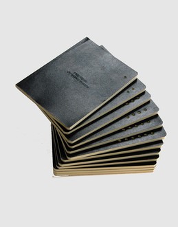
Here is a great little set of plain note/sketch books that I just bought my boyfriend for his birthday. They are kind of like little moleskins. There are 12 of them, one for each month, or just a nice quantity that will last you a while. Each one has perferations to coordinate to each month (1=Jan, 2= Feb, etc.) or to keep them in the order you use them. They were designed by Alessandro Esteri. Ah they are just so nice and clean and simple, I kind of want to go buy myself a set!

Wednesday, April 25, 2007

ya,

so this design group (Zak Group)was just on both computer luv, and newstoday,
but i dont care, i really like this poster they did...

Tuesday, April 24, 2007

Next year...

Although my 21st bday is a year and a week away, I already know what I wanna do.
I will have a party, like this, in my apartment! Just you wait.
Image and video hosting by TinyPic
...my roomie just had a great idea, instead of all pink, make it a cmyk party. ahaha, i need to do this!


p.s. this video is amazing...
Image and video hosting by TinyPic

I just bought the prettiest book ever!

It's called Some One Like You by Jamels W. Foley. It was printed in 1915.
The link shows you kinda what it looks like illlustration wise,
but the real text in the book is 100x's more lovely!
Image and video hosting by TinyPic

Monday, April 23, 2007

a logo i dont love, by people i do love

This little logo here has an awful lot to live up to in my eyes...


A. It's obviously for Kate Moss (whom I love)
B. It was art directed by Peter Saville (whom I love 1000x's more)
C. It was in collaboration with the typographer Paul Barnes (whom I really like)
D. It's based off a typeface by Alexey Brodovitch (whom I also love a lot)

At first glance I really like it, but then the more I look at it, not so much. I think it is very pretty don't get me wrong, but I think I just like the typeface...I don't really know how I feel about this as a logo. Anyways, you can read more about it here.

Sunday, April 22, 2007

ya,

I have this disease.
but I love it.
and heres a cool flickr group that goes with it

Friday, April 20, 2007

pics around town

these are just some random photos i took around town of stuff i liked for whatever reason.
sorry for the horrible quality of some.

random semi on 17th street...
Image and video hosting by TinyPic


inside covers of a book at rolling stone...
Image and video hosting by TinyPicImage and video hosting by TinyPic


taxi passing on 14th street...
Image and video hosting by TinyPic


bicycle sign that i've always loved on 6th ave...
Image and video hosting by TinyPic


sign on 8th ave near 14th?...
Image and video hosting by TinyPic


sticker in the subway waiting for the L...
Image and video hosting by TinyPic


a cover of a book in the book store in MOMA...
Image and video hosting by TinyPic


lovely letter "B" on my chocolate...
Image and video hosting by TinyPic


page in a random magazine...
Image and video hosting by TinyPic


poster on 8th ave & 14th? st. for the NY ballet's Romeo & Juliet...
Image and video hosting by TinyPic


M Night? banner for a hotel? in midtown...
Image and video hosting by TinyPic


sign for new apts on 17th street, I have more better photos of the whole thing ill post later...
Image and video hosting by TinyPic


sign from back home (cleveland) for the stan hewitt museum...
Image and video hosting by TinyPic

I need this...


American apparel has a new Lamé Suspender Swimsuit! Ah so hot! The american apparel I live above doesn't even have it yet! I want the silver one and then i can wear it with my Silver Lamé Leggings and look like a robot. sweet!
[jk i wouldnt actually wear them together]


***UPDATE 5/8/06***
Now the american apparel downstairs does have it, and I tried it on last week.
I tragically decided not to buy it since I realized it has no practical wearablity,
and because it kind of made me feel a little like this...haha

Thursday, April 19, 2007

My first worthwhile post?

"EVERYTHING REPEATS ITSELF.
ITS AMAZING THAT EVERYBODY
THINKS THINGS ARE NEW,
BUT IT'S ALL REPEAT"
-andy warhol

I m at my Rolling Stone internship right now and barely anyone is here so I have nothing to do but this...
So I always love it when I notice blatent rip-offs, or just obviously heavily inspired designs. It's kind of funny to see the way things relate to eachother, even though I never know if its by coincidence or not. [My friend Andrew once had a good blog that was only about inspired, related, and ripped-off designs he found, but sadly he has since, to my knowledge, deleted it.] Also, a great site for this kinda stuff is You Thought We Wouldn't Notice.


My first heavily inspired designs are as follows...


This is a design by Lance Wyman for the 1968 Olympics in Mexico City. (this design in the original idea to my knowledge.) I first saw this design in my History of Graphic Design class a few weeks ago.
[side note: this designer is a teacher at my school, and I reallyyy wanted to take his Spatial Graphics class, but it was full :'( ]


Seeing that design then reminded me of this...
Image and video hosting by TinyPic
This is a design by Sayshiro "Rito" Fujimoto with Nobody Design Products which I saw a few months ago in my amazinggg book of Japanese graphic design called Narita Inspected. This design is from 2000 by the way.


Another thing that Wyman's design reminded me of was this...
Image and video hosting by TinyPic
This is the logo for The Times Square Alliance , I pass this on a few trash cans on my way to Rolling Stone. I tried to find who designed it, but I haven't had any luck so far.

I wonder if Lance Wyman's design was the original idea like this or if there were others before before him, aside from the already assumed inspirations from op-art and things like that. I bet there are a bunch more designs inspired by these out there too.


***********************


So a few weeks ago I saw a screening of The Helvetica Movie.
It was not all that great, but thats besided the point,
they gave us all this free helvetica notebook...
Image and video hosting by TinyPic
It was pretty unneccessay, but now I see that Veer is selling the notebooks on their website for $22! I shoulda grabbed a stack on my way out and sold em on the street half price haha

Friday, April 13, 2007

Blah

So i dont have time at the moment to post anything worthwhile, but ya, this was amusing for about 5mins...
overheard in new york

Thursday, April 5, 2007

finally i started it!!!

ive been meaning to create this for quite some time, finally i got around to it! this is a blog basically to organize all the design shit i like in. my safari bookmarks are out of control and i cant remember what anything is anymore so instead im juss gunna post all the links and pics of stuff here so its easier to reference. this will also help if i ever get around to making the book/magazine i wanna make. i will to put up all of my past links and stuff on here to but i have a feeling its going to take a while.

i guess to just to start my blog off with a ridiculous yet adorably design, heres an object i saw at the MOMA design store today.
its called the eggulator...

now if only had $17 to spend on something ill never use...


Website Hit Counters


***

labels