This is a new book cover, lettering by Lauren Nassef.
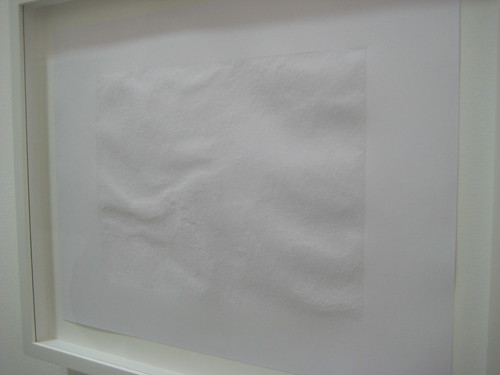
and this piece by Tom Chamberlain from the Frieze Art Fair recently...
2 comments:
Anonymous
said...
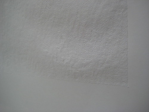
Thanks for the feature. It's funny, a lot of these pin-prick drawings have been cropping up lately. I think I've seen two different artists doing the same thing at galleries since I sent the Obsession cover to the printer in January. For what it's worth, Lauren Nassef did most of her pin-prick work in 2001, and revisited her older technique for this book cover at my request.
Thanks for the comment! I do actually much prefer the presentation of the pinpricks on the book cover. The way it uses the underside (or appears to be) of the paper adds a nice depth to it. It also enhances the obsessional nature of it just imagining that the letters were all made reversed on the other side of the paper!


2 comments:
Thanks for the feature. It's funny, a lot of these pin-prick drawings have been cropping up lately. I think I've seen two different artists doing the same thing at galleries since I sent the Obsession cover to the printer in January. For what it's worth, Lauren Nassef did most of her pin-prick work in 2001, and revisited her older technique for this book cover at my request.
Isaac Tobin
Thanks for the comment! I do actually much prefer the presentation of the pinpricks on the book cover. The way it uses the underside (or appears to be) of the paper adds a nice depth to it. It also enhances the obsessional nature of it just imagining that the letters were all made reversed on the other side of the paper!
Post a Comment